
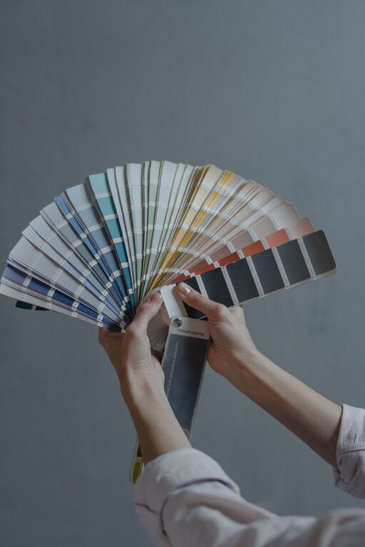
Creating a peaceful and soothing atmosphere in your home starts with choosing the right colors. Calm colors can transform any space into a relaxing retreat, helping you unwind after a busy day. If you’re planning to refresh your home’s look or starting from scratch, selecting the perfect calm colors is an essential step.
In this post, we’ll share practical tips for choosing calm colors that work well in your home, along with ideas on how to use them effectively. Whether you want to paint a single room or your entire house, these guidelines will help you create a tranquil environment you’ll love.
Why Choose Calm Colors?
Calm colors help reduce stress and create a sense of balance. They often reflect natural tones and soft shades that are easy on the eyes. Unlike bright or dark colors, calm hues can make a space feel more open, serene, and inviting.
Common calm color families include:
– Soft blues
– Muted greens
– Light grays
– Warm neutrals like beige and taupe
– Gentle pastel tones
These colors work well in bedrooms, living rooms, bathrooms, and even kitchens because they encourage relaxation and a peaceful mood.
Tips for Choosing Calm Colors
1. Consider the Room’s Purpose
Start by thinking about how the room will be used. For example:
– Bedroom: Opt for soothing blues, lavender, or soft greens to promote restful sleep.
– Living Room: Warm neutrals and muted earthy tones create a cozy yet calm space for family time.
– Bathroom: Light blues, seafoam green, or pale gray can evoke a spa-like feel.
– Home Office: Soft greens or subtle grays may help maintain focus without overstimulation.
Matching the color to the room’s function ensures the space feels comfortable and intentional.
2. Look at Natural Light
Lighting dramatically affects how colors appear. Before selecting a color, observe how much natural light the room receives throughout the day:
– Rooms with lots of sunlight can handle cooler tones like soft blue or gray.
– Rooms with less natural light may benefit from warm neutrals or light pastel shades to avoid feeling too dark or cold.
Try to test paint samples on your walls and observe them at different times of day to see how the colors shift with changing light.
3. Use a Color Palette for Balance
Calm colors often work best when combined in complementary palettes rather than a single color alone. Consider creating a color scheme using:
– A main color for walls
– An accent color for trim or furniture
– One or two additional shades for textiles and decorations
For example, pair a soft gray wall color with white trim and muted blue accents for a harmonious, calm effect.
4. Choose Matte or Satin Finishes
Finish impacts the feel of a color. Matte or satin paint finishes tend to look softer and less reflective than gloss or semi-gloss finishes, which can sometimes make colors feel harsher. For calm spaces, matte or satin finishes enhance the subdued and relaxing vibe.
5. Incorporate Natural Elements
Colors inspired by nature tend to feel calming. Consider green tones that recall leaves, blue shades like the sky or ocean, and browns or tans resembling wood and stone. These colors foster a connection with the outdoors and add to a restful atmosphere.
6. Avoid Overly Bright or Dark Shades
Very bright or intense colors like neon or deep, dark hues can be stimulating rather than calming. If you want to include these tones, use them sparingly as accents (like pillows or artwork) instead of main wall colors.
7. Think About Your Personal Preferences
While general color psychology can guide your choices, your personal feelings about certain colors matter most. Choose shades you naturally find soothing and that make you feel comfortable.
8. Don’t Forget the Ceiling and Floors
Consider including calm colors in your ceiling and flooring choices. Light-colored ceilings with soft tones help open up a room and add to the tranquil feel. Similarly, natural wood floors or light rugs in subtle colors complement calm wall hues and enhance the overall atmosphere.
Examples of Calm Color Combinations
Here are a few tried-and-true color combos to inspire your home makeover:
– Soft Blue + Warm White + Light Wood: Great for bedrooms or bathrooms.
– Muted Sage Green + Cream + Pale Gray: Perfect for living rooms and kitchens.
– Light Taupe + Dusty Rose + Ivory: Adds warmth and calm to common areas.
– Pale Lavender + Soft Gray + White Trim: Creates a quiet, peaceful bedroom vibe.
Final Thoughts
Choosing calm colors for your home is about creating a space that feels restful and welcoming. By considering the room’s use, lighting, color finishes, and your own tastes, you can select colors that help you relax and enjoy your home more fully.
Remember that testing colors before fully committing is key. Paint samples and small tests will give you the best sense of how a color performs in your unique space.
Let calm colors inspire your home transformation and invite peace and comfort into your daily life. Happy decorating!
About the Author